这篇文章主要介绍了Android形状图形与状态列表图形及九宫格图片的应用方法,文中通过示例代码介绍的非常详细,对大家的学习或者工作具有一定的参考学习价值,需要的朋友们下面随着小编来一起学习吧!
一、图形Drawable
Drawable类型表达了各种各样的图形,包括图片、色块、画板、背景等。
包含图片在内的图形文件放在res目录的各个drawable目录下,其中drawable目录一般保存描述性的XML文件,而图片文件一般放在具体分辨率的drawable目录下。
各视图的background属性、ImageView和ImageButton的src属性、TextView和Button四个方向的drawable***系列属性都可以引用图形文件。
二、形状图形
Shape图形又称形状图形,它用来描述常见的几何形状,包括矩形、圆角矩形、圆形、椭圆等。
形状图形的定义文件是以Shape标签为根节点的XML描述文件。
实际开发一般主要使用3个节点:stroke、corners、solid。
1、类型的形状:
- rectangle:矩形,默认
- oval:椭圆,此时corners节点失效
- line:直线,此时必须设置stroke节点,不然报错
- ring:圆环
2、size(尺寸)
size是shape的下级节点,它描述了形状图形的宽高尺寸,若无size节点,则表示宽高与宿主视图一样大小,下面是size节点的常用属性说明:
- height:像素类型,图形高度。
- width:像素类型,图形宽度。
3、stroke(描边)
stroke是shape的下级节点,它描述了形状图形的描边规格,若无stroke节点,则表示不存在描边,下面是stroke节点的常用属性说明:
- color:颜色类型,描边的颜色。
- dashGap:像素类型,每段虚线之间的间隔。
- dashWidth:像素类型,每段虚线的宽度,若dashGap和dashWidth有一个值为0,则描边为实线。
- wdith:像素类型,描边的厚度。
4、corners(圆角)
corners是shape的下级节点,它描述了形状图形的圆角大小,若无corners节点,则表示无圆角,下面是常用属性:
- bottomLeftRadius:坐下圆角的半径。
- bottomRightRadius:右下圆角的半径。
- topLeftRadius:左上圆角的半径。
- topRightRadius:右上圆角的半径。
- radius:四个圆角的半径。
5、solid(填充)
solid是shape的下级节点,它描述了形状图形的填充色彩,若无solid节点,则表示无填充颜色,下面的属性说明:
- color:内部填充的颜色。
6、padding(间隔)
padding是shape的下级节点,它描述了形状图形与周围边界的间隔,若无padding节点,则表示四周不设间隔,下面的常用属性:
- top:与上方的间隔。
- bottom:与下方的间隔。
- left:与左边的间隔。
- right:与右边的间隔。
7、gradient(渐变)
gradient是shape的下级节点,它描述了形状图形的颜色渐变,若无gradient节点,则表示没有渐变效果,下面的常用属性:
- angle:整型,渐变的起始角度,为0表示9点钟位置,增值大表示往逆时针方向旋转。
- type:渐变类型。
| 渐变类型 | 说明 |
| linear | 线性渐变,默认 |
| radial | 放射渐变,起始颜色就是圆心颜色 |
| sweep | 滚动渐变,即一个线段以某个端点为圆心做360°旋转 |
- centerX:浮点型,圆心的X坐标,type=linear时不可用。
- centerY:浮点型,圆心的Y坐标,type=linear时不可用。
- gradientRadius:整型,渐变半径,type=radial时需要设置。
- centerColor:渐变的中间颜色。
- startColor:渐变的起始颜色。
- endColor:渐变的终止颜色。
- useLevel:布尔类型,设置为true为无渐变色。
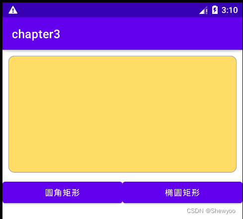
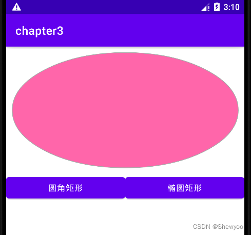
例:点击按钮切换图形
xml文件
<LinearLayout xmlns:android="http://schemas.android.com/apk/res/android"
android:layout_width="match_parent"
android:layout_height="match_parent"
android:orientation="vertical">
<View
android:id="@+id/v_content"
android:layout_width="match_parent"
android:layout_height="200dp"
android:layout_margin="10dp"/>
<LinearLayout
android:layout_width="match_parent"
android:layout_height="wrap_content"
android:orientation="horizontal">
<Button
android:id="@+id/btn_rect"
android:layout_width="0dp"
android:layout_height="wrap_content"
android:layout_weight="1"
android:text="圆角矩形"/>
<Button
android:id="@+id/btn_oval"
android:layout_width="0dp"
android:layout_height="wrap_content"
android:layout_weight="1"
android:text="椭圆矩形"/>
</LinearLayout>
</LinearLayout>
drawable下新建rect.xml文件
<shape xmlns:android="http://schemas.android.com/apk/res/android">
<!--指定形状内部的填充颜色-->
<solid android:color="#ffdd66"/>
<!--指定形状轮廓的粗细与颜色-->
<stroke android:width="1dp"
android:color="#aaaaaa"/>
<!--指定形状四个圆角的半径-->
<corners android:radius="10dp"/>
</shape>
oval.xml文件
<shape xmlns:android="http://schemas.android.com/apk/res/android"
android:shape="oval">
<!--指定形状内部的填充颜色-->
<solid android:color="#ff66aa"/>
<!--指定形状轮廓的粗细与颜色-->
<stroke android:width="1dp"
android:color="#aaaaaa"/>
</shape>
java代码
public class DrawableShapeActivity extends AppCompatActivity implements View.OnClickListener {
private View v_content;
@Override
protected void onCreate(Bundle savedInstanceState) {
super.onCreate(savedInstanceState);
setContentView(R.layout.activity_drawable_shape);
v_content = findViewById(R.id.v_content);
findViewById(R.id.btn_rect).setOnClickListener(this);
findViewById(R.id.btn_oval).setOnClickListener(this);
//v_content的背景设置为圆角矩形
v_content.setBackgroundResource(R.drawable.shape_rect_gold);
}
@Override
public void onClick(View view) {
switch (view.getId()){
case R.id.btn_rect:
v_content.setBackgroundResource(R.drawable.shape_rect_gold);
break;
case R.id.btn_oval:
v_content.setBackgroundResource(R.drawable.shape_oval_rose);
break;
}
}
}
运行结果:
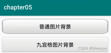
三、九宫格图片
将某张图片设置成视图背景时,如果图片尺寸太小,则会自动拉伸使之填满背景,但图片拉的过大,会变得模糊。
使用九宫格图片:将图片后缀改为.9.png
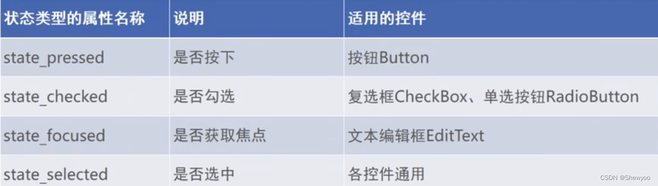
四、状态列表图形
Button按钮的背景在正常情况下是凸起的,在按下时是凹陷的,从按下到弹起的过程,用户便能知道点击了这个按钮。
例:
当按钮被按下时使用的是第一个item的图片
<item android:drawable="@drawable/button_pressed" android:state_pressed="true"/>
<item android:drawable="@drawable/button_normal"/>
状态类型的取值说明
状态列表图形不仅用于按钮控件,还可用于其他拥有多种状态的控件。
 榜一大姐没钱后天降神豪系统
 神豪:系统让我成了刷款机
 被杀死后,我妈偷听我的心声
 兼职明星:不小心成顶流了
 失忆后我要离婚
 帝王错爱:相知不相许
 捡到落魄将军后
 我有一位完美夫君
 电脑里的游戏突然连通现实了
 被逼入宫殉葬,我手刃狗皇帝
 退婚世子后,她改嫁朝中摄政王
 绝世高手张宇
 广城的初夏都特别热许雨晴
 虞溪蔷沈泊礼
 天才萌宝:妈咪只想当咸鱼
 我穿成了小说里的贫穷路人甲