这篇文章主要介绍了Python读取CSV文件并进行数据可视化绘图,文章围绕主题基于Python展开CSV文件读取的详细内容介绍,感兴趣的小伙伴可以参考一下!
介绍:文件sitka_weather_07-2018_simple.csv是阿拉斯加州锡特卡2018年1月1日的天气数据,其中包含当天的最高温度和最低温度。数据文件存储与data文件夹下,接下来用Python读取该文件数据,再基于数据进行可视化绘图。(详细细节请看代码注释)
sitka_highs.py
import csv # 导入csv模块
from datetime import datetime
import matplotlib.pyplot as plt
filename = 'data/sitka_weather_07-2018_simple.csv'
with open(filename) as f:
reader = csv.reader(f)
header_row = next(reader) # 返回文件的下一行,在这便是首行,即文件头
# for index, column_header in enumerate(header_row): # 对列表调用了 enumerate()来获取每个元素的索引及其值,方便我们提取需要的数据列
# print(index, column_header)
# 从文件中获取最高温度
dates, highs = [], []
for row in reader:
current_date = datetime.strptime(row[2], '%Y-%m-%d')
high = int(row[5])
dates.append(current_date)
highs.append(high)
# 根据最高温度绘制图形
plt.style.use('seaborn')
fig, ax = plt.subplots()
ax.plot(dates, highs, c='red')
# 设置图形的格式
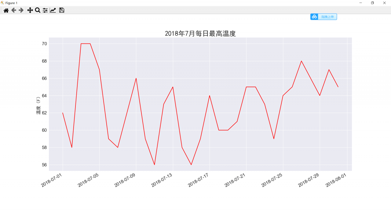
ax.set_title("2018年7月每日最高温度", fontproperties="SimHei", fontsize=24)
ax.set_xlabel('', fontproperties="SimHei", fontsize=16)
fig.autofmt_xdate()
ax.set_ylabel("温度(F)", fontproperties="SimHei", fontsize=16)
ax.tick_params(axis='both', which='major', labelsize=16)
plt.show()
运行结果如下:
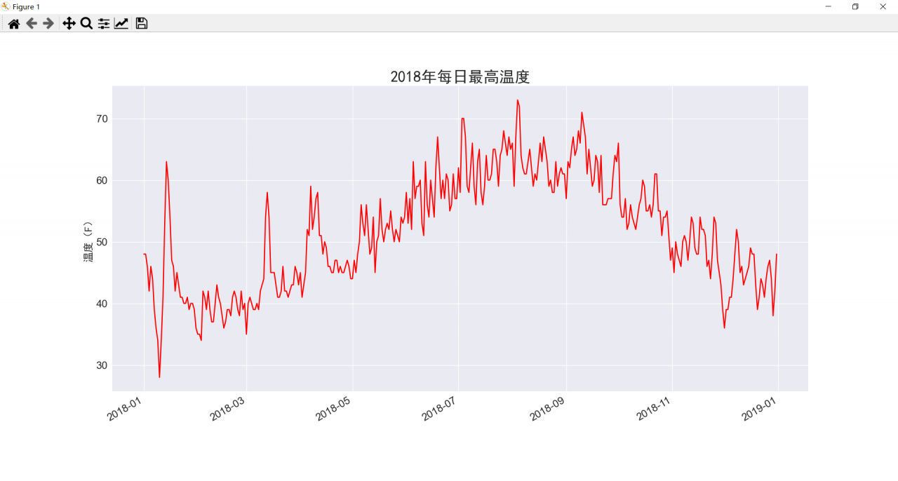
设置以上图标后,我们来添加更多的数据,生成一副更复杂的锡特卡天气图。将sitka_weather_2018_simple.csv数据文件置于data文件夹下,该文件包含整年的锡特卡天气数据。
对代码进行修改:
sitka_highs.py
import csv  # 导入csv模块
from datetime import datetime
import matplotlib.pyplot as plt
filename = 'data/sitka_weather_2018_simple.csv'
with open(filename) as f:
reader = csv.reader(f)
header_row = next(reader)  # 返回文件的下一行,在这便是首行,即文件头

  # for index, column_header in enumerate(header_row):  # 对列表调用了 enumerate()来获取每个元素的索引及其值,方便我们提取需要的数据列
  # print(index, column_header)

# 从文件中获取最高温度
dates, highs = [], []
for row in reader:
current_date = datetime.strptime(row[2], '%Y-%m-%d')
high = int(row[5])
dates.append(current_date)
highs.append(high)

# 根据最高温度绘制图形
plt.style.use('seaborn')
fig, ax = plt.subplots()
ax.plot(dates, highs, c='red')
# 设置图形的格式
ax.set_title("2018年每日最高温度", fontproperties="SimHei", fontsize=24)
ax.set_xlabel('', fontproperties="SimHei", fontsize=16)
fig.autofmt_xdate()
ax.set_ylabel("温度(F)", fontproperties="SimHei", fontsize=16)
ax.tick_params(axis='both', which='major', labelsize=16)
plt.show()
运行结果如下:
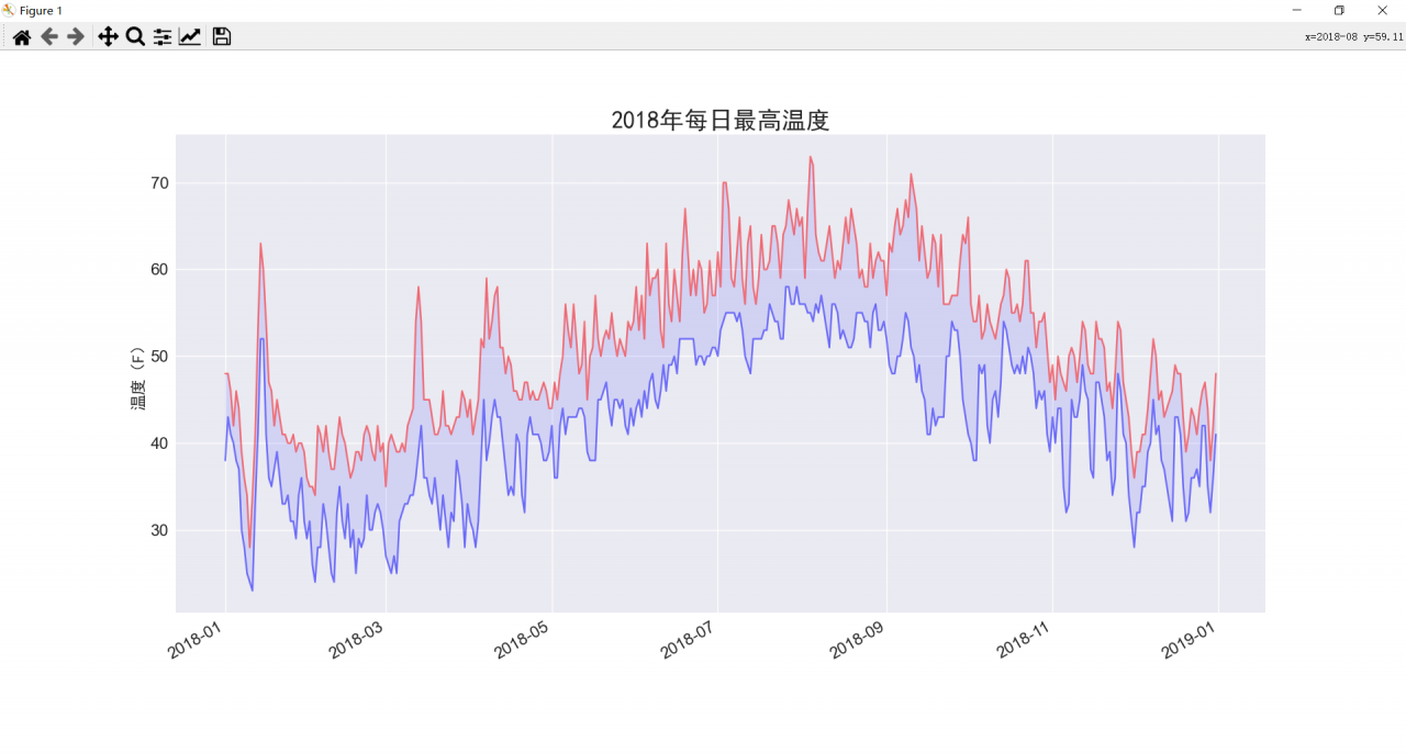
代码再改进:虽然上图已经显示了丰富的数据,但是还能再添加最低温度数据,使其更有用
对代码进行修改:
sitka_highs_lows.py
import csv  # 导入csv模块
from datetime import datetime
import matplotlib.pyplot as plt
filename = 'data/sitka_weather_2018_simple.csv'
with open(filename) as f:
reader = csv.reader(f)
header_row = next(reader)  # 返回文件的下一行,在这便是首行,即文件头

  # for index, column_header in enumerate(header_row):  # 对列表调用了 enumerate()来获取每个元素的索引及其值,方便我们提取需要的数据列
  # print(index, column_header)

# 从文件中获取日期、最高温度和最低温度
dates, highs, lows = [], [], []
for row in reader:
current_date = datetime.strptime(row[2], '%Y-%m-%d')
high = int(row[5])
low = int(row[6])
dates.append(current_date)
highs.append(high)
lows.append(low)

# 根据最高温度和最低温度绘制图形
plt.style.use('seaborn')
fig, ax = plt.subplots()
ax.plot(dates, highs, c='red', alpha=0.5)  # alpha指定颜色的透明度,0为完全透明
ax.plot(dates, lows, c='blue', alpha=0.5)
ax.fill_between(dates, highs, lows, facecolor='blue',alpha=0.1)

# 设置图形的格式
ax.set_title("2018年每日最高温度", fontproperties="SimHei", fontsize=24)
ax.set_xlabel('', fontproperties="SimHei", fontsize=16)
fig.autofmt_xdate()
ax.set_ylabel("温度(F)", fontproperties="SimHei", fontsize=16)
ax.tick_params(axis='both', which='major', labelsize=16)
plt.show()
运行结果如下:
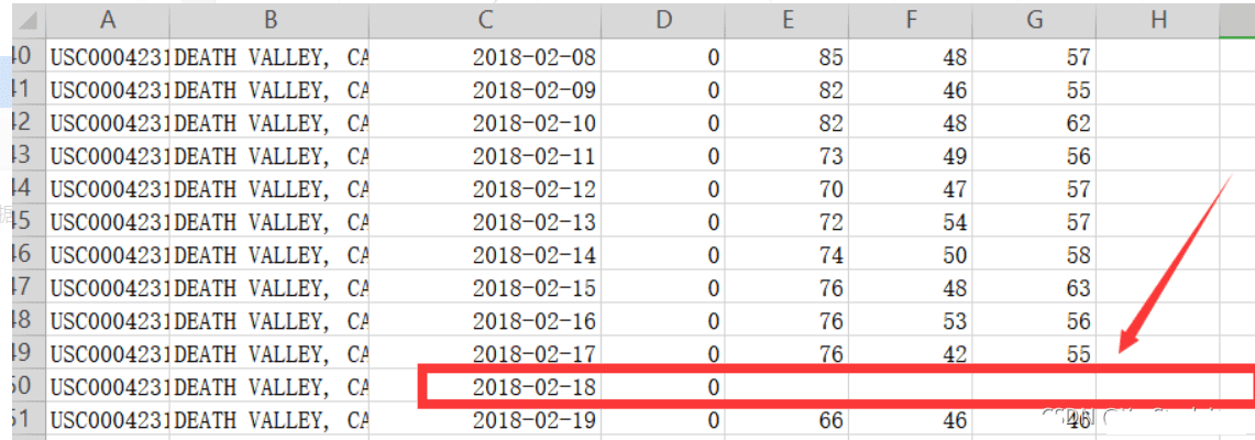
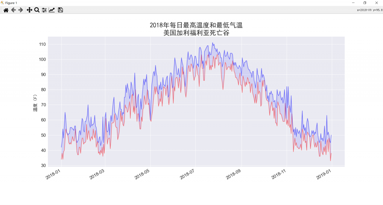
此外,读取CSV文件过程中,数据可能缺失,程序运行时就会报错甚至崩溃。所有需要在从CSV文件中读取值时执行错误检查代码,对可能的异常进行处理,更换数据文件为:death_valley_2018_simple.csv ,该文件有缺失值。
对代码进行修改:
death_valley_highs_lows.py
import csv  # 导入csv模块
from datetime import datetime
import matplotlib.pyplot as plt
filename = 'data/death_valley_2018_simple.csv'
with open(filename) as f:
reader = csv.reader(f)
header_row = next(reader)  # 返回文件的下一行,在这便是首行,即文件头

  # for index, column_header in enumerate(header_row):  # 对列表调用了 enumerate()来获取每个元素的索引及其值,方便我们提取需要的数据列
  # print(index, column_header)

# 从文件中获取日期、最高温度和最低温度
dates, highs, lows = [], [], []
for row in reader:
current_date = datetime.strptime(row[2], '%Y-%m-%d')
try:
high = int(row[5])
low = int(row[6])
except ValueError:
print(f"Missing data for {current_date}")
else:
dates.append(current_date)
highs.append(high)
lows.append(low)

# 根据最高温度和最低温度绘制图形
plt.style.use('seaborn')
fig, ax = plt.subplots()
ax.plot(dates, highs, c='red', alpha=0.5)  # alpha指定颜色的透明度,0为完全透明
ax.plot(dates, lows, c='blue', alpha=0.5)
ax.fill_between(dates, highs, lows, facecolor='blue',alpha=0.1)
# 设置图形的格式
ax.set_title("2018年每日最高温度和最低气温\n美国加利福利亚死亡谷", fontproperties="SimHei", fontsize=24)
ax.set_xlabel('', fontproperties="SimHei", fontsize=16)
fig.autofmt_xdate()
ax.set_ylabel("温度(F)", fontproperties="SimHei", fontsize=16)
ax.tick_params(axis='both', which='major', labelsize=16)
plt.show()
如果现在运行death_valley_highs_lows.py,将会发现缺失数据的日期只有一个:
Missing data for 2018-02-18 00:00:00
妥善地处理错误后,代码能够生成图形并忽略缺失数据的那天。运行结果如下:
 榜一大姐没钱后天降神豪系统
 神豪:系统让我成了刷款机
 被杀死后,我妈偷听我的心声
 兼职明星:不小心成顶流了
 失忆后我要离婚
 帝王错爱:相知不相许
 捡到落魄将军后
 我有一位完美夫君
 电脑里的游戏突然连通现实了
 被逼入宫殉葬,我手刃狗皇帝
 退婚世子后,她改嫁朝中摄政王
 绝世高手张宇
 广城的初夏都特别热许雨晴
 虞溪蔷沈泊礼
 天才萌宝:妈咪只想当咸鱼
 我穿成了小说里的贫穷路人甲