我们在首次使用内容类 App 的时候,不少都会让我们选择个人偏好。这种通常是通过标签来实现,比如列举出一系列的技术栈,然后让我们选择。通过这些标签选择可以预先知道用户的偏好信息,从而可以选择感兴趣的内容进行推送,这样会让用户快速看到想看的内容。我们本篇就来看看 Flutter 如何实现兴趣标签的选择,这可以通过 InputChip 来轻松实现。
InputChip
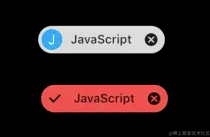
InputChip 类是一个简单的小组件,它的内容区左侧有一个 avatar 子组件,右侧是一个 label 组件。然后支持删除和标记选中,因此非常适合做兴趣标签的选择。下面是未选中和选中的两个状态,选中的时候会在左侧的 avatar 区域打个勾表示选中。这个组件相比我们自己去写一个类似的组件来说会简化很多。而且,多个InputChip 组件可以作为Wrap 组件的子组件,实现多个 InputChip 时自动等间距排布和超出宽度自动换行,这也恰恰是做兴趣标签所需要的。
我们来看一下 InputChip 构造方法和主要属性。
const InputChip({
  Key? key,
  this.avatar,
  required this.label,
  this.labelStyle,
  this.labelPadding,
  this.selected = false,
  this.isEnabled = true,
  this.onSelected,
  this.deleteIcon,
  this.onDeleted,
  this.deleteIconColor,
  this.deleteButtonTooltipMessage,
  this.onPressed,
  this.pressElevation,
  this.disabledColor,
  this.selectedColor,
  this.tooltip,
  this.side,
  this.shape,
  this.clipBehavior = Clip.none,
  this.focusNode,
  this.autofocus = false,
  this.backgroundColor,
  this.padding,
  this.visualDensity,
  this.materialTapTargetSize,
  this.elevation,
  this.shadowColor,
  this.selectedShadowColor,
  this.showCheckmark,
  this.checkmarkColor,
  this.avatarBorder = const CircleBorder(),
  @Deprecated(
'Migrate to deleteButtonTooltipMessage. '
'This feature was deprecated after v2.10.0-0.3.pre.'
  )
  this.useDeleteButtonTooltip = true,
})
属性很多,但是实际用的是下面这几个:
avatar:左侧的子组件,通常可以用使用圆形(如CircularAvatar)组件,注意高度是不可改的,随整个InputChip的高度决定;label:右侧的标签组件,通常是一个文本组件,支持单行或多行文本,该组件决定了InputChip的高度;labelPadding:标签的内边距;selected:选中状态,如果是选中状态则会在左侧有个打勾的标记;isEnabled:是否启用,默认是启用状态,如果禁用则选中事件的回调(onSelected)和点击事件回调(onPressed)都无法使用,但是删除是可以用的。onSelected:选中状态改变时的回调函数。deleteIcon:删除图标,默认是Icons.cancel图标。onDeleted:删除事件回调。onPressed:点击事件回调;backgroundColor和selectedColor:默认背景色和选中后背景色。
通过这些属性我们就可以构建基础的兴趣标签,比如下面的代码,这里的 item 是标签的数据实体对象,有三个属性,分别是标签名称 name,标签默认背景色color 和选中状态 selected。 当标签选中后我们将 InputChip 的avatar设置为 null,从而不显示 avatar。
InputChip(
labelPadding: const EdgeInsets.fromLTRB(10, 0, 10, 0),
backgroundColor: item.color,
selectedColor: Colors.red[400],
selected: item.selected,
onSelected: (isSelected) {
  setState(() {
item.selected = isSelected;
  });
},
avatar: item.selected
? null
: CircleAvatar(
backgroundColor: Colors.lightBlue,
child: Text(
  item.name.substring(0, 1),
  style: const TextStyle(color: Colors.white),
),
  ),
label: Text(
  item.name,
),
  )
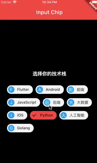
兴趣标签选择实现
兴趣标签通常会有多个,这时候需要逐个等间距排开,超出宽度后换行。这个可以通过 Wrap 组件和 InputChip 组件实现。代码非常简单,就是将一组 InputChip 组件作为 Wrap 组件的 children 参数,然后设置 Wrap 中子组件的间距即可。
Wrap(
  spacing: 10.0,
  children: _techList
  .map(
(item) => InputChip(
  labelPadding: const EdgeInsets.fromLTRB(10, 0, 10, 0),
  backgroundColor: item.color,
  selectedColor: Colors.red[400],
  selected: item.selected,
  onSelected: (isSelected) {
setState(() {
  item.selected = isSelected;
});
  },
  avatar: item.selected
  ? null
  : CircleAvatar(
  backgroundColor: Colors.lightBlue,
  child: Text(
item.name.substring(0, 1),
style: const TextStyle(color: Colors.white),
  ),
),
  label: Text(
item.name,
  ),
),
  )
  .toList(),
),
最终我们实现的效果如下图所示。
总结
本篇介绍了 Flutter 中的 InputChip组件的使用,同时给出了如何用 InputChip实现兴趣标签的选择。在实际应用中,InputChip 还可以用于多选,在聊天会评论列表展示用户信息(头像加昵称)。可以看到,InputChip 是个非常小巧但很实用的组件。
 战神老婆受不了,求我下山
 重新开始,我不需要你
 踹掉渣男后,我成了太子妃
 强取豪夺:疯批国师掌中娇
 风月难逃
风月难逃 开局陷死局,绝美女帝要卸磨杀驴
 再见老公
再见老公 何秋若付渐成
 清宁桃花
清宁桃花 官运权途
官运权途 妈妈想让我替弟弟高考
 绝世高手张宇
 广城的初夏都特别热许雨晴
 虞溪蔷沈泊礼
 天才萌宝:妈咪只想当咸鱼
 我穿成了小说里的贫穷路人甲